2.24.2013

Bradford

The brief for this project was to create a print in repeat for curtains, cushions and fabric blinds. The print I designed was made up of one motif, this was flipped and rotated to create a fuller image. From this I was able to repeat it to create a design in repeat, with this I added my colour scheme. I have kept the same colour pallet from my Digetex project, creating hand painted backgrounds for my print to be applied onto. I have put the image in context of fabric blinds, the green background and pink motif works the best for this. 


Final Wallpapers In Context


2.22.2013

Final Designs

This is my final design for my collection of prints. This one is more intricate and took a lot more time creating. I kept the same motif but changed the colouring slightly to see my options for the outcome. By changing one colour or the tone on the image it gives it a completely different look.


Final Designs

I've applied my colour pallet to my final designs. These will be printed full scale 54" ready for repeat printing. I feel that the colours work well through out the prints and compliment the spring/summer 2013 colour trends. 


Wallpaper design to walls

To see how my designs will work on a large scale, I applied them to a room senario. I fell that they work well as a statement wall, if it was all over a room it would take away from the pattern and look cluttered.


2.20.2013

Colour Prints

Now I have my print designs worked out I wanted to add colour to them. These all turned out flat and not as I envisioned so I am going to take my images onto photoshop and edit the motifs. 


2.19.2013

Wallpaper Designs


Colour Pallet

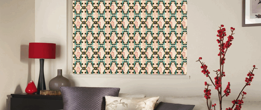
To make my designs contemporary from the dated style of baroque, I have looked into the fashion trends and colours of spring summer 2013. The main colours I am going to use are pastel pink, pastel blue, mint green and a rich gold. These will compliment each other and create exciting wallpapers from my designs. 


Flat Vernacular


The wallpapers that Flat Vernacular create are amazing. Their use of colour and pattern is what I want to produce myself, not using too many colours and sticking to a limited pallet. The image at the bottom is an interesting way of creating new and exciting wall paper with old designs.  


2.17.2013

Drawings

I have drawn more detailed motifs to use for my wallpaper designs. Having a more intricate starting point will allow my final work to be more interesting and visually pleasing.