2.24.2014

Exhibition and Evaluation


This unit has completely changed the way that I design and also my attitude towards my own work. The beginning of this project was very slow, being unsure on what I wanted to create and where I was pulling my inspiration from hindered my progress for longer then I would have liked. By adding in the external project and creating my designs for a company, it has moved my work rapidly into a more professional style. From this point my time management and focus on this project moved up a level, as the designs were very arduous to create. I do however think that the attention to detail and added time on each design is shown in the end prints.

Using making as a starting point and not drawing was something that I wanted to try, change the way that I create designs and move into 3D wallpapers. This process was not successful, it was time very time consuming for an end result that I was not happy with and have not used. The photography and collaboration images have been the strongest areas from this minor project. Combining my work with another artist took a new angle into my designs, with the end result having a mystical and layered feel attached. I have used research from a broad range of media, looking into film, installations, architectures to name a few. The collection of artists and designers I have used had a running theme between them, which took me a while to realise why I was using each. Most of the works were multiples of one motif or material, often light was involved and each had an etherial look. This realisation of what I was searching for in my research has allowed the outcome of my work to become clearer to me, allowing my focus to be put in the right area. 

This clarity in my ideas and where I wanted my work to go was a real turning point in this unit, but also in my practice as a whole. I knew I wanted to create pattern and shapes from an unusual source and move these prints into wallpaper. From this point forward I have focussed on refining my drawing techniques and composition of pieces. 

The external brief played a large part in this, as my designs had to be professional and to a standard that I was happy to send off to a print company. The drawings and collage work I was creating at this time were interesting, however were not to a high enough standard to fit the dimensions of the brief, as when enlarged became blurred. This made assessing my work critical, finding out which areas worked well and what I needed to refine to create work to send off. At the time this seemed to be a set back in the amount of work I was producing, however the attention to detail was necessary to create prints that were to a standard I was happy with. The upscaling of my drawing and increased time spent on each design provided the print that was used for the Humpties submission. If I had more time on this project I would have moved this print into different colour ways and submitted two or three different prints. I addressed this thought after the submission and came to conclusion that I would tackle these ideas throughout the rest of the project.

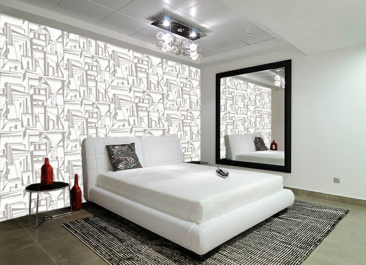
Having a clear context for my work became very important at this point of the project, more research into print styles and interiors was needed to finalised where I envisioned my work. Statement wallpaper and wall panels became the focus for these prints, using them as a focal point within a room. To see my work at its full potential I have spent a lot of time putting my prints into visualisations. These have been incredibly helpful in working out colour schemes and scales for different interior settings. The darker and larger prints work best in large, open spaces, in particular in comercial settings. The warmer tones and softer prints work the best in home settings, with the print being in a smaller scale. 

I am going to carry on these prints and this style of working into unit X. As I have a few finalised prints and a colour scheme, I am going to explore different materials that my prints can be applied onto. Etching onto plastic and pinting onto fabric are my next steps with my work. 

2.19.2014

Visualisations


Visualisations of my wallpaper in different settings is a very important step for my practice, it allows me to get a true sense of what my prints would look like installed to scale. Often in these images I change the scale of my prints, depending on the size of a space. For a large room I think that the print works better on a larger scale, therefore a smaller room requires a smaller scale print. The images I have chosen are from four different scenarios, showing my prints in a variety of settings. The warm tones work well for the first living space, it balances well the wooden staircase and cream colours. The darker print for the second image fits well for the spacing of the room. As the room is large and open, a scaled up, dark, strong print works well. It provides a feature wall for the room, which is how I envisioned my work to be used. The third image shows the print in another light, the softer creams and greys work well for a bedroom space. It creates a less eye catching wallpaper which is less memorable, however the softer tones are more calming therefore could be used across a wide range of rooms. The final visualisation takes my print to a much larger scale, using the design with larger sections. This allowed a more balanced colour pallet, as there is more of the two greys on show. Again, the open space of the room is why a darker print works successfully and isn't too over powering. 


2.16.2014

Colour


I have completed the drawing work for my final prints and they are ready to be in colour ways, however I do not have a set of colours for this project. Finding colour is something I struggle with, so I researched colour trends for interiors for Spring/Summer 2014. The Trend Bible provided a full set of colours that I found appealing and would be transferable onto my prints. The earthy tones and shades will work as a good contrast to the structured drawing. 


The colour relationships when applied to my prints completely change the outcome of each one. The print can move from soft and delicate to strong and masculin with one colour change. The terracotta tones work the most successfully, they provide a warmth that would work well within a home environment. The darker prints would work best in office space or in a form of lobby, the darker they get the more menacing the print feels. As a collection I have really enjoyed using this colour pallet, experimenting with combinations to create work that can stand alone in a variety of interior spaces. 

2.09.2014

Final Prints 2 & 3


I have been self evaluating my prints, which sections work the best and which areas need improvement.  This is a crucial part of my work as I want my final prints to be as refined as possible, especially in scaling and pattern positioning. The original drawings that are used in repeat have been drawn square and the width of standard wallpaper, so when it comes to printing they will fit perfectly onto the roll. 

As I put my prints into repeat, I have been working out how to make patterns run through the print as it is repeated. The top print I have added a subtle zig zag through the design, this has allowed a stripe to form as the the print extends. In my previous print I found that the darker areas were the most successful when applied into a room setting, therefore I have been adding thicker and harsher lines into these designs to explore this idea. I really focussed on adding larger dark areas on the bottom print, the shapes that I created were designed to create a diagonal stripe along the wall once the wallpaper was installed. This print works well in repeat as the different shapes break up the half drop pattern, it has a sense of different layers and has a depth that the other two prints do not have. I have found that my prints work best in a half drop design, as the repeat creates a horizontal stripe when repeated across. 


2.01.2014

Research


The prints I have been designing are aimed for an interior context, the wallpaper to be applied as a feature wall, the focal point for a room. This style of wallpaper was popular in the 1970s, eccentric and stand out prints were everywhere at this time. Though these prints look slightly dated to modern day print style, I enjoy the vibrance they bring to the room scenarios below. Each of these prints are the eye catching element, something that makes the rooms unique. 


The designed prints at 'wallpaper from the 70s' is where I can see my work fitting, they create fun and interesting prints in large varieties of styles . They take risks in their designs, with high contrast colours and unusual shapes and patterns. The pricing from their website also gives an idea on the pricing these types of prints are commercially. I am unsure on whether I will want to work freelance or designing for a company post university, however I would like my work to be sold around this price level.