
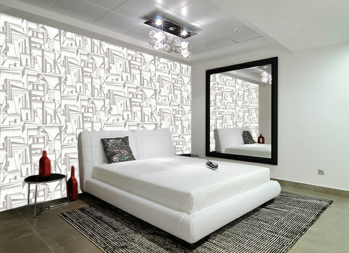
Visualisations of my wallpaper in different settings is a very important step for my practice, it allows me to get a true sense of what my prints would look like installed to scale. Often in these images I change the scale of my prints, depending on the size of a space. For a large room I think that the print works better on a larger scale, therefore a smaller room requires a smaller scale print. The images I have chosen are from four different scenarios, showing my prints in a variety of settings. The warm tones work well for the first living space, it balances well the wooden staircase and cream colours. The darker print for the second image fits well for the spacing of the room. As the room is large and open, a scaled up, dark, strong print works well. It provides a feature wall for the room, which is how I envisioned my work to be used. The third image shows the print in another light, the softer creams and greys work well for a bedroom space. It creates a less eye catching wallpaper which is less memorable, however the softer tones are more calming therefore could be used across a wide range of rooms. The final visualisation takes my print to a much larger scale, using the design with larger sections. This allowed a more balanced colour pallet, as there is more of the two greys on show. Again, the open space of the room is why a darker print works successfully and isn't too over powering.


No comments:
Post a Comment