

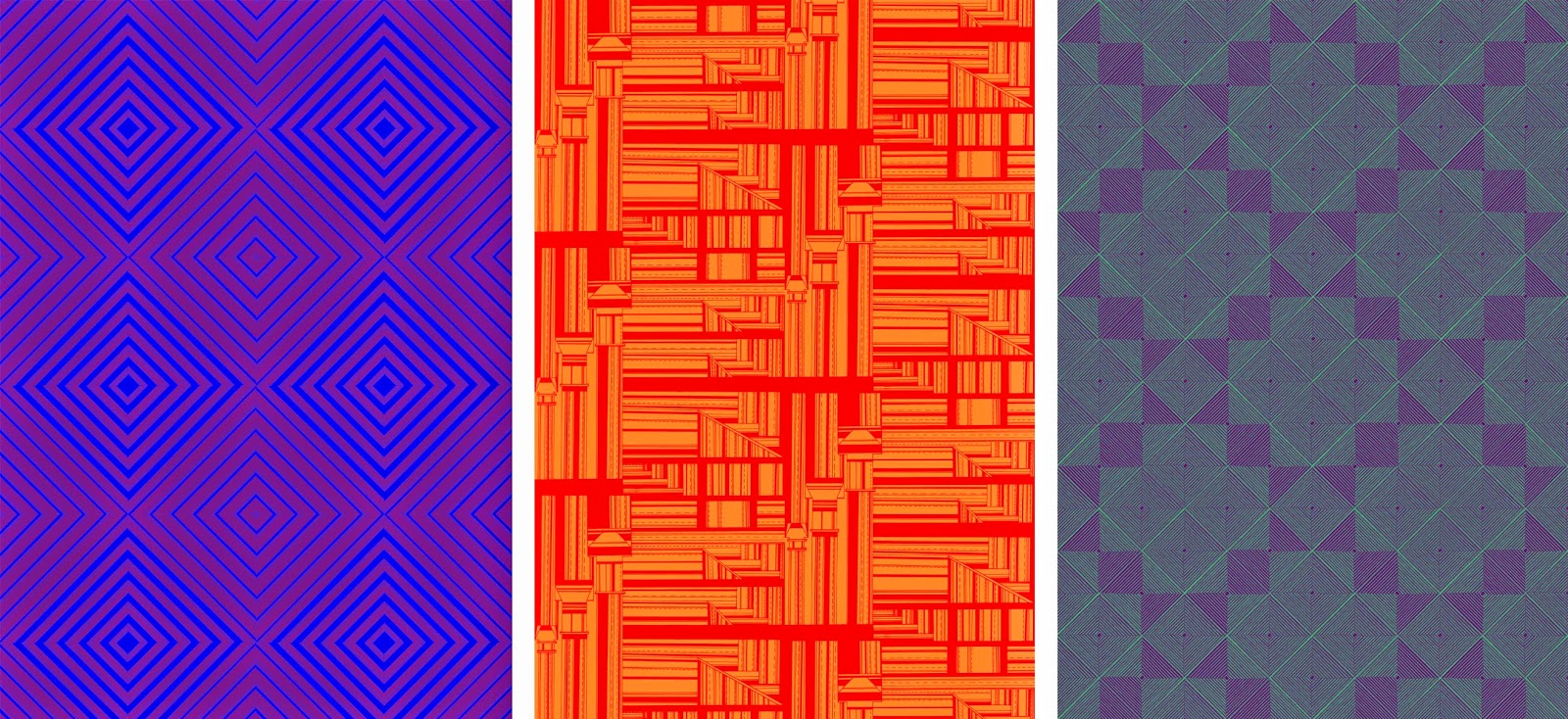
The prints I have designed are drawn in black and white, therefore they are well fitting to work with colour relationships. I am working with duo colours, experimenting with opposing colours and complimentary colours.
I have kept to using primary and secondary colours within my prints, focussing on how the shapes and design of each print changes the look of the surface. Each print I have moved into colour has 24 colour ways, opposing primary colours and also panning around a colour wheel.
Once I had created each print into 12 colour ways I had a realisation that the colours could be reversed. The prints change dramatically depending on which colour is in the foreground or background. Though this process of moving all my prints into colour on photoshop and creating the different colours ways was laborious, it has given me a great range of prints. Depending on each colour scheme, prints that are the same can look completely different, from something as simple as changing one colour. Certain colours work on one print and compliment the style yet on others create a truly ugly print. Since the prints have been in colour I feel that they have grown an enormous amount, from soft, subtle tonal changes to bright, garish prints.


No comments:
Post a Comment