5.22.2014

Final Evaluation


This unit has really pushed me as a designer, with the allocated time for the completion being the smallest of the year so far yet the strive to want to create the most work. I threw myself into this project from the very beginning, usually I take a few weeks to fully get into a project. By addressing this unit as a loose continuation from my last project I knew where I wanted my prints to go and I was fully aware of the dedication that was needed to achieve this. 

Researching into optical prints has transformed this collection, moving the prints away from the graphic style construction and concentrating on pattern form itself. Designers such as Cole + Sons and Bridget Riley have been a great source of ideas, showing how lines in black and white can create texture and surface pattern on prints. From this I began my design work, looking at brick patterns and knit constructions it allowed me to refine how I created initial drawings. With my attention to detail and knowing how I wanted a repeat to look this drawing element of the project took the most time. By hand drawing each design it allowed the end prints to have a strong structure but not be computerised in the outcome. Some of the drawings worked well on their own, however when put into repeat did not look how I would have hoped and I did not take them further. I have always wanted to create a hand drawn collection, and through drawing in this style I feel I have achieved this. 

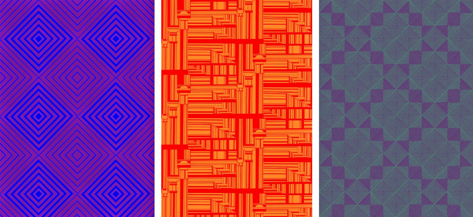
Moving my prints into colour has always been an obstacle to overcome through out my practice, knowing which colours will work in this style of print. By keeping my colour palet to primary and secondary it has allowed the prints to be focused on colour relationships. The change within a print from a simple colour change has both surprised and impressed me. Some of the colour pairings I have made in this unit have not been successful and have turned my prints into ugly patterns, however other pairings have created subtle and beautiful prints. I have spent a lot of time transforming most of my prints into colours, each one into a 24 colour way pallet. This has been very beneficial as colour pairings that work for one print have a completely different effect on another. 

Along side the practical element of this unit I have had a strong questioning on where my work will fall after university, what kind of job I will be going to interviews for, where do I see myself as a post graduate. I collaborated with my graphic design friend to resolve some of these questions, by giving myself a brand and a logo I felt that my work would be more memorable. I have now a strong logo that works with my style of working and fits well within the final prints. Accompanying this we have created four different backed business cards to give to potential employers, being made square to add another edge to my work. To add to the final degree show we have made a hand out, folding down to a small pocket sized flyer. This showcases three of my designs and gives a sense of my style and working to people.  

5.19.2014

Visualisations


Being a wallpaper designer visualisations are an important part of my practice as they allow my prints to be shown in context. I spend a lot of time finding images that I feel would be appropriate for my prints and would compliment the pattern and colour schemes. I strive to find spaces that challenge the prints, be that on a corner wall or to fit in with furnishings. I create these images to show my prints in a way that looks real,  being applied onto the space or wall. Using different settings, such as hall spaces or children's bedrooms, it shows my work in a good range of scenarios. 


5.17.2014

Branding


This project has made me think about where I want to end up as a print designer, where my work will be sold, places where I could work and how I want to be received by people. Thinking towards my degree show and my future I wanted to have something to confirm myself as a designer and not just another post graduate. To do this I have collaborated with my graphic design friend William Cotterill to create a brand that represents me. The first step was to create a logo, or a type face for my name. Once this was made we had many meetings on deciding on what I wish to have at the degree show. 

I wanted a business card that showcases my prints simply but is clear on my information. To make the cards memorable we have made them square shaped, with four differing backs, to add an extra edge compared with other people's cards. I am very happy with how these have turned out, and they are currently at a print house in Altrincham being made ready for degree show.

To go along side this I wanted a hand out that people could take away, something that would be looked at more then once and hopefully will get me recognised. The hand out we have created works well with my style of print and pattern work. It is a fairly simple design yet it showcases three of my designs. Two are partial prints but the other folds out to a larger, full print that will hopefully catch people's attention. 


5.12.2014

Colour


The prints I have designed are drawn in black and white, therefore they are well fitting to work with colour relationships. I am working with duo colours, experimenting with opposing colours and complimentary colours. 

I have kept to using primary and secondary colours within my prints, focussing on how the shapes and design of each print changes the look of the surface. Each print I have moved into colour has 24 colour ways, opposing primary colours and also panning around a colour wheel. 

Once I had created each print into 12 colour ways I had a realisation that the colours could be reversed. The prints change dramatically depending on which colour is in the foreground or background. Though this process of moving all my prints into colour on photoshop and creating the different colours ways was laborious, it has given me a great range of prints. Depending on each colour scheme, prints that are the same can look completely different, from something as simple as changing one colour. Certain colours work on one print and compliment the style yet on others create a truly ugly print. Since the prints have been in colour I feel that they have grown an enormous amount, from soft, subtle tonal changes to bright, garish prints.


5.10.2014

External Projects


In this unit I have not subjected my prints to being solely for the final hand in, I have put myself forward to other opportunities. As I have envisioned my prints to be on a large scale, the vertical gallery pitch was ideal for the work to be shown in its intended scale. For this pitch I presented five different prints that I felt would fit in well with the space, with there being low lighting in this area the brightness of the print would lightened up the area and be a focal point for the space.  Unfortunately I did not receive the commission, however it was a very important learning experience for my practice. It allowed me to communicate with printing companies and learn how much my work would cost outside of university. 


Whilst researching where my prints would fit and how they could be used, I was approached by Ford Beaumont to allow them to use my prints in their virtual gallery. I was very interested in how they would use my prints, as I was told they were not going to be used in a conventional way. The outcome was better then I could have envisioned. My work was used on a rang of three dimensional objects, with floating blocks and spheres. The opening night of this exhibition was very exciting and enjoyable to see my prints used in another area of art.