Showing posts with label Colour. Show all posts

5.12.2014

Colour


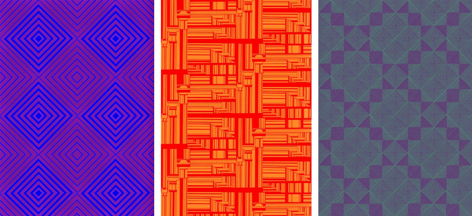
The prints I have designed are drawn in black and white, therefore they are well fitting to work with colour relationships. I am working with duo colours, experimenting with opposing colours and complimentary colours. 

I have kept to using primary and secondary colours within my prints, focussing on how the shapes and design of each print changes the look of the surface. Each print I have moved into colour has 24 colour ways, opposing primary colours and also panning around a colour wheel. 

Once I had created each print into 12 colour ways I had a realisation that the colours could be reversed. The prints change dramatically depending on which colour is in the foreground or background. Though this process of moving all my prints into colour on photoshop and creating the different colours ways was laborious, it has given me a great range of prints. Depending on each colour scheme, prints that are the same can look completely different, from something as simple as changing one colour. Certain colours work on one print and compliment the style yet on others create a truly ugly print. Since the prints have been in colour I feel that they have grown an enormous amount, from soft, subtle tonal changes to bright, garish prints.



2.19.2014

Visualisations


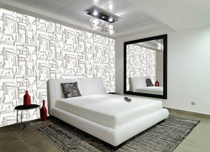
Visualisations of my wallpaper in different settings is a very important step for my practice, it allows me to get a true sense of what my prints would look like installed to scale. Often in these images I change the scale of my prints, depending on the size of a space. For a large room I think that the print works better on a larger scale, therefore a smaller room requires a smaller scale print. The images I have chosen are from four different scenarios, showing my prints in a variety of settings. The warm tones work well for the first living space, it balances well the wooden staircase and cream colours. The darker print for the second image fits well for the spacing of the room. As the room is large and open, a scaled up, dark, strong print works well. It provides a feature wall for the room, which is how I envisioned my work to be used. The third image shows the print in another light, the softer creams and greys work well for a bedroom space. It creates a less eye catching wallpaper which is less memorable, however the softer tones are more calming therefore could be used across a wide range of rooms. The final visualisation takes my print to a much larger scale, using the design with larger sections. This allowed a more balanced colour pallet, as there is more of the two greys on show. Again, the open space of the room is why a darker print works successfully and isn't too over powering. 


2.16.2014

Colour


I have completed the drawing work for my final prints and they are ready to be in colour ways, however I do not have a set of colours for this project. Finding colour is something I struggle with, so I researched colour trends for interiors for Spring/Summer 2014. The Trend Bible provided a full set of colours that I found appealing and would be transferable onto my prints. The earthy tones and shades will work as a good contrast to the structured drawing. 


The colour relationships when applied to my prints completely change the outcome of each one. The print can move from soft and delicate to strong and masculin with one colour change. The terracotta tones work the most successfully, they provide a warmth that would work well within a home environment. The darker prints would work best in office space or in a form of lobby, the darker they get the more menacing the print feels. As a collection I have really enjoyed using this colour pallet, experimenting with combinations to create work that can stand alone in a variety of interior spaces.