Showing posts with label Wallpaper. Show all posts

5.22.2014

Final Evaluation


This unit has really pushed me as a designer, with the allocated time for the completion being the smallest of the year so far yet the strive to want to create the most work. I threw myself into this project from the very beginning, usually I take a few weeks to fully get into a project. By addressing this unit as a loose continuation from my last project I knew where I wanted my prints to go and I was fully aware of the dedication that was needed to achieve this. 

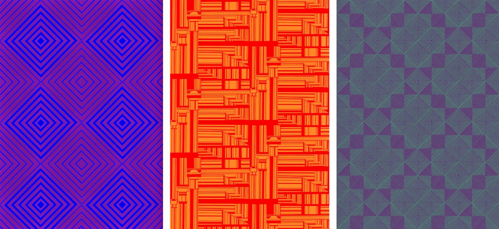
Researching into optical prints has transformed this collection, moving the prints away from the graphic style construction and concentrating on pattern form itself. Designers such as Cole + Sons and Bridget Riley have been a great source of ideas, showing how lines in black and white can create texture and surface pattern on prints. From this I began my design work, looking at brick patterns and knit constructions it allowed me to refine how I created initial drawings. With my attention to detail and knowing how I wanted a repeat to look this drawing element of the project took the most time. By hand drawing each design it allowed the end prints to have a strong structure but not be computerised in the outcome. Some of the drawings worked well on their own, however when put into repeat did not look how I would have hoped and I did not take them further. I have always wanted to create a hand drawn collection, and through drawing in this style I feel I have achieved this. 

Moving my prints into colour has always been an obstacle to overcome through out my practice, knowing which colours will work in this style of print. By keeping my colour palet to primary and secondary it has allowed the prints to be focused on colour relationships. The change within a print from a simple colour change has both surprised and impressed me. Some of the colour pairings I have made in this unit have not been successful and have turned my prints into ugly patterns, however other pairings have created subtle and beautiful prints. I have spent a lot of time transforming most of my prints into colours, each one into a 24 colour way pallet. This has been very beneficial as colour pairings that work for one print have a completely different effect on another. 

Along side the practical element of this unit I have had a strong questioning on where my work will fall after university, what kind of job I will be going to interviews for, where do I see myself as a post graduate. I collaborated with my graphic design friend to resolve some of these questions, by giving myself a brand and a logo I felt that my work would be more memorable. I have now a strong logo that works with my style of working and fits well within the final prints. Accompanying this we have created four different backed business cards to give to potential employers, being made square to add another edge to my work. To add to the final degree show we have made a hand out, folding down to a small pocket sized flyer. This showcases three of my designs and gives a sense of my style and working to people.  

5.19.2014

Visualisations


Being a wallpaper designer visualisations are an important part of my practice as they allow my prints to be shown in context. I spend a lot of time finding images that I feel would be appropriate for my prints and would compliment the pattern and colour schemes. I strive to find spaces that challenge the prints, be that on a corner wall or to fit in with furnishings. I create these images to show my prints in a way that looks real,  being applied onto the space or wall. Using different settings, such as hall spaces or children's bedrooms, it shows my work in a good range of scenarios. 


5.12.2014

Colour


The prints I have designed are drawn in black and white, therefore they are well fitting to work with colour relationships. I am working with duo colours, experimenting with opposing colours and complimentary colours. 

I have kept to using primary and secondary colours within my prints, focussing on how the shapes and design of each print changes the look of the surface. Each print I have moved into colour has 24 colour ways, opposing primary colours and also panning around a colour wheel. 

Once I had created each print into 12 colour ways I had a realisation that the colours could be reversed. The prints change dramatically depending on which colour is in the foreground or background. Though this process of moving all my prints into colour on photoshop and creating the different colours ways was laborious, it has given me a great range of prints. Depending on each colour scheme, prints that are the same can look completely different, from something as simple as changing one colour. Certain colours work on one print and compliment the style yet on others create a truly ugly print. Since the prints have been in colour I feel that they have grown an enormous amount, from soft, subtle tonal changes to bright, garish prints.


4.30.2014

Prints in repeat

The designs I have created through hand drawing has a taken a long time, however the time spent making them accurate has been necessary. I have drawn in three different styles, optical, angular and shapes. These different style of drawing have given very different outcome when put into repeat.

Through researching and experimenting with how repeat patterns are put together, it has allowed each design to be utilised into creating multiple different prints from one image. The orignal drawings have been scanned it at 600dpi to allow the prints to be blown up into a large scale without loosing any quality. Some designs have worked well as a drawing but when repeated have created obscure prints that do not work as well as I had hoped. This has meant that I have gone back and altered certain drawings to allow them to repeat better.

The optical style prints have worked the most successfully, moving my work away from the graphic style construction and into a more pattern based outcome. These prints have also had the most outcomes through rotation and scaling, with many of the prints creating tonal levels though I am still working in black and white. 


3.24.2014

Inspiration


This unit I am following on from my previous work, expanding this drawing style with new line qualities and shapes. My last collection showed a graphics style of print, with complex layers and exciting angles across a surface. I aim to refine this into more structured pattern work and surface design in this new collection. I am using my previous collection and also the research that it entailed as my starting point as I feel that near to the end of the last project I was creating work that I was very interested in and could be pushed much further. The use of positive and negative spaces to create complex and detailed prints needs to be explored more, expanding research into pattern construction and repeat processes will benefit this greatly. 

I have gone back to basics and begun research into interior wallpaper, however I am focussing on bright and eye catching prints as this is where I envision my work to be. The use of colour and pattern to transform a room is both interesting to me and also a fresh idea in my practice. I have always used a more muted colour pallet so I am going to explore how my prints can really come alive once brighter colour is added.


Researching into vibrant print I have become very interested in optical prints, the use of line and opposing colours to create texture is intriguing. Works from artist such as Bridget Riley and Victor Vasarely are simple with the use of black and white but are every changing in depth the more they are observed. This drawing style relates well to mine and the construction is something I am going to explore. I am going to explore first with black and white, to control the shaping on the patterns and the balance of positive and negative spaces. The idea of turning a flat, uninteresting surface into once with many shapes and virtual layers is an exiting area to move into. If this style of drawing is successful I am going to explore colour relationships, focussing on two opposing colours and the optical blending across a print.    


2.24.2014

Exhibition and Evaluation


This unit has completely changed the way that I design and also my attitude towards my own work. The beginning of this project was very slow, being unsure on what I wanted to create and where I was pulling my inspiration from hindered my progress for longer then I would have liked. By adding in the external project and creating my designs for a company, it has moved my work rapidly into a more professional style. From this point my time management and focus on this project moved up a level, as the designs were very arduous to create. I do however think that the attention to detail and added time on each design is shown in the end prints.

Using making as a starting point and not drawing was something that I wanted to try, change the way that I create designs and move into 3D wallpapers. This process was not successful, it was time very time consuming for an end result that I was not happy with and have not used. The photography and collaboration images have been the strongest areas from this minor project. Combining my work with another artist took a new angle into my designs, with the end result having a mystical and layered feel attached. I have used research from a broad range of media, looking into film, installations, architectures to name a few. The collection of artists and designers I have used had a running theme between them, which took me a while to realise why I was using each. Most of the works were multiples of one motif or material, often light was involved and each had an etherial look. This realisation of what I was searching for in my research has allowed the outcome of my work to become clearer to me, allowing my focus to be put in the right area. 

This clarity in my ideas and where I wanted my work to go was a real turning point in this unit, but also in my practice as a whole. I knew I wanted to create pattern and shapes from an unusual source and move these prints into wallpaper. From this point forward I have focussed on refining my drawing techniques and composition of pieces. 

The external brief played a large part in this, as my designs had to be professional and to a standard that I was happy to send off to a print company. The drawings and collage work I was creating at this time were interesting, however were not to a high enough standard to fit the dimensions of the brief, as when enlarged became blurred. This made assessing my work critical, finding out which areas worked well and what I needed to refine to create work to send off. At the time this seemed to be a set back in the amount of work I was producing, however the attention to detail was necessary to create prints that were to a standard I was happy with. The upscaling of my drawing and increased time spent on each design provided the print that was used for the Humpties submission. If I had more time on this project I would have moved this print into different colour ways and submitted two or three different prints. I addressed this thought after the submission and came to conclusion that I would tackle these ideas throughout the rest of the project.

Having a clear context for my work became very important at this point of the project, more research into print styles and interiors was needed to finalised where I envisioned my work. Statement wallpaper and wall panels became the focus for these prints, using them as a focal point within a room. To see my work at its full potential I have spent a lot of time putting my prints into visualisations. These have been incredibly helpful in working out colour schemes and scales for different interior settings. The darker and larger prints work best in large, open spaces, in particular in comercial settings. The warmer tones and softer prints work the best in home settings, with the print being in a smaller scale. 

I am going to carry on these prints and this style of working into unit X. As I have a few finalised prints and a colour scheme, I am going to explore different materials that my prints can be applied onto. Etching onto plastic and pinting onto fabric are my next steps with my work. 

2.19.2014

Visualisations


Visualisations of my wallpaper in different settings is a very important step for my practice, it allows me to get a true sense of what my prints would look like installed to scale. Often in these images I change the scale of my prints, depending on the size of a space. For a large room I think that the print works better on a larger scale, therefore a smaller room requires a smaller scale print. The images I have chosen are from four different scenarios, showing my prints in a variety of settings. The warm tones work well for the first living space, it balances well the wooden staircase and cream colours. The darker print for the second image fits well for the spacing of the room. As the room is large and open, a scaled up, dark, strong print works well. It provides a feature wall for the room, which is how I envisioned my work to be used. The third image shows the print in another light, the softer creams and greys work well for a bedroom space. It creates a less eye catching wallpaper which is less memorable, however the softer tones are more calming therefore could be used across a wide range of rooms. The final visualisation takes my print to a much larger scale, using the design with larger sections. This allowed a more balanced colour pallet, as there is more of the two greys on show. Again, the open space of the room is why a darker print works successfully and isn't too over powering. 


2.16.2014

Colour


I have completed the drawing work for my final prints and they are ready to be in colour ways, however I do not have a set of colours for this project. Finding colour is something I struggle with, so I researched colour trends for interiors for Spring/Summer 2014. The Trend Bible provided a full set of colours that I found appealing and would be transferable onto my prints. The earthy tones and shades will work as a good contrast to the structured drawing. 


The colour relationships when applied to my prints completely change the outcome of each one. The print can move from soft and delicate to strong and masculin with one colour change. The terracotta tones work the most successfully, they provide a warmth that would work well within a home environment. The darker prints would work best in office space or in a form of lobby, the darker they get the more menacing the print feels. As a collection I have really enjoyed using this colour pallet, experimenting with combinations to create work that can stand alone in a variety of interior spaces. 

2.09.2014

Final Prints 2 & 3


I have been self evaluating my prints, which sections work the best and which areas need improvement.  This is a crucial part of my work as I want my final prints to be as refined as possible, especially in scaling and pattern positioning. The original drawings that are used in repeat have been drawn square and the width of standard wallpaper, so when it comes to printing they will fit perfectly onto the roll. 

As I put my prints into repeat, I have been working out how to make patterns run through the print as it is repeated. The top print I have added a subtle zig zag through the design, this has allowed a stripe to form as the the print extends. In my previous print I found that the darker areas were the most successful when applied into a room setting, therefore I have been adding thicker and harsher lines into these designs to explore this idea. I really focussed on adding larger dark areas on the bottom print, the shapes that I created were designed to create a diagonal stripe along the wall once the wallpaper was installed. This print works well in repeat as the different shapes break up the half drop pattern, it has a sense of different layers and has a depth that the other two prints do not have. I have found that my prints work best in a half drop design, as the repeat creates a horizontal stripe when repeated across. 


2.01.2014

Research


The prints I have been designing are aimed for an interior context, the wallpaper to be applied as a feature wall, the focal point for a room. This style of wallpaper was popular in the 1970s, eccentric and stand out prints were everywhere at this time. Though these prints look slightly dated to modern day print style, I enjoy the vibrance they bring to the room scenarios below. Each of these prints are the eye catching element, something that makes the rooms unique. 


The designed prints at 'wallpaper from the 70s' is where I can see my work fitting, they create fun and interesting prints in large varieties of styles . They take risks in their designs, with high contrast colours and unusual shapes and patterns. The pricing from their website also gives an idea on the pricing these types of prints are commercially. I am unsure on whether I will want to work freelance or designing for a company post university, however I would like my work to be sold around this price level.

1.27.2014

Final Print 1


The large scale drawings have been used in photoshop and put into a half drop design to create this wallpaper. The black and white creates an eye catching image, with changing angles and built up areas. The sections that are complete blacked out shapes work well to break up the pattern, as it would look too crowded if those areas were not there. The visualisations are to a double scale of the print design, the prints works better when enlarged. I have begun changing the print into different colour ways, however I have not finalised a colour pallet as I struggle to find colour schemes that are fitting with current wallpapers.