Showing posts with label Visualisation. Show all posts

5.19.2014

Visualisations


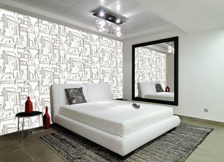
Being a wallpaper designer visualisations are an important part of my practice as they allow my prints to be shown in context. I spend a lot of time finding images that I feel would be appropriate for my prints and would compliment the pattern and colour schemes. I strive to find spaces that challenge the prints, be that on a corner wall or to fit in with furnishings. I create these images to show my prints in a way that looks real,  being applied onto the space or wall. Using different settings, such as hall spaces or children's bedrooms, it shows my work in a good range of scenarios. 


2.19.2014

Visualisations


Visualisations of my wallpaper in different settings is a very important step for my practice, it allows me to get a true sense of what my prints would look like installed to scale. Often in these images I change the scale of my prints, depending on the size of a space. For a large room I think that the print works better on a larger scale, therefore a smaller room requires a smaller scale print. The images I have chosen are from four different scenarios, showing my prints in a variety of settings. The warm tones work well for the first living space, it balances well the wooden staircase and cream colours. The darker print for the second image fits well for the spacing of the room. As the room is large and open, a scaled up, dark, strong print works well. It provides a feature wall for the room, which is how I envisioned my work to be used. The third image shows the print in another light, the softer creams and greys work well for a bedroom space. It creates a less eye catching wallpaper which is less memorable, however the softer tones are more calming therefore could be used across a wide range of rooms. The final visualisation takes my print to a much larger scale, using the design with larger sections. This allowed a more balanced colour pallet, as there is more of the two greys on show. Again, the open space of the room is why a darker print works successfully and isn't too over powering. 


1.27.2014

Final Print 1


The large scale drawings have been used in photoshop and put into a half drop design to create this wallpaper. The black and white creates an eye catching image, with changing angles and built up areas. The sections that are complete blacked out shapes work well to break up the pattern, as it would look too crowded if those areas were not there. The visualisations are to a double scale of the print design, the prints works better when enlarged. I have begun changing the print into different colour ways, however I have not finalised a colour pallet as I struggle to find colour schemes that are fitting with current wallpapers.  


12.05.2013

Large Scale Panels

 I have been researching where I see my work ending up, which has steered me away from wallpaper and more towards wall panels. These would be a feature pieces as the focal point in a room, possibly paper or printed onto fabric/glass/perspex. The reassembled images work best on a larger scale, these images are A1. The below visualisation is the style and scale of how I see my work progressing.