5.12.2014

Colour


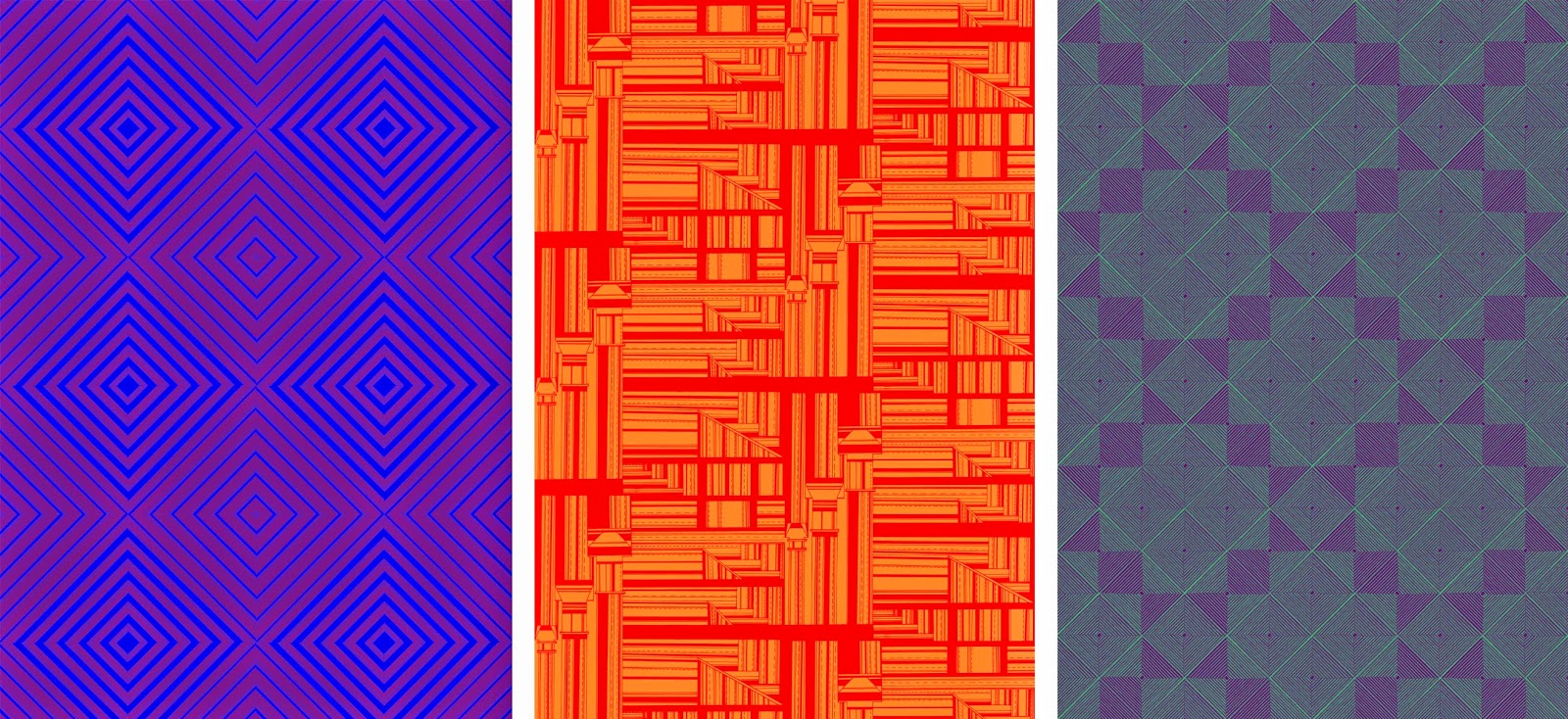
The prints I have designed are drawn in black and white, therefore they are well fitting to work with colour relationships. I am working with duo colours, experimenting with opposing colours and complimentary colours. 

I have kept to using primary and secondary colours within my prints, focussing on how the shapes and design of each print changes the look of the surface. Each print I have moved into colour has 24 colour ways, opposing primary colours and also panning around a colour wheel. 

Once I had created each print into 12 colour ways I had a realisation that the colours could be reversed. The prints change dramatically depending on which colour is in the foreground or background. Though this process of moving all my prints into colour on photoshop and creating the different colours ways was laborious, it has given me a great range of prints. Depending on each colour scheme, prints that are the same can look completely different, from something as simple as changing one colour. Certain colours work on one print and compliment the style yet on others create a truly ugly print. Since the prints have been in colour I feel that they have grown an enormous amount, from soft, subtle tonal changes to bright, garish prints.



5.10.2014

External Projects


In this unit I have not subjected my prints to being solely for the final hand in, I have put myself forward to other opportunities. As I have envisioned my prints to be on a large scale, the vertical gallery pitch was ideal for the work to be shown in its intended scale. For this pitch I presented five different prints that I felt would fit in well with the space, with there being low lighting in this area the brightness of the print would lightened up the area and be a focal point for the space.  Unfortunately I did not receive the commission, however it was a very important learning experience for my practice. It allowed me to communicate with printing companies and learn how much my work would cost outside of university. 


Whilst researching where my prints would fit and how they could be used, I was approached by Ford Beaumont to allow them to use my prints in their virtual gallery. I was very interested in how they would use my prints, as I was told they were not going to be used in a conventional way. The outcome was better then I could have envisioned. My work was used on a rang of three dimensional objects, with floating blocks and spheres. The opening night of this exhibition was very exciting and enjoyable to see my prints used in another area of art.  


4.30.2014

Prints in repeat

The designs I have created through hand drawing has a taken a long time, however the time spent making them accurate has been necessary. I have drawn in three different styles, optical, angular and shapes. These different style of drawing have given very different outcome when put into repeat.

Through researching and experimenting with how repeat patterns are put together, it has allowed each design to be utilised into creating multiple different prints from one image. The orignal drawings have been scanned it at 600dpi to allow the prints to be blown up into a large scale without loosing any quality. Some designs have worked well as a drawing but when repeated have created obscure prints that do not work as well as I had hoped. This has meant that I have gone back and altered certain drawings to allow them to repeat better.

The optical style prints have worked the most successfully, moving my work away from the graphic style construction and into a more pattern based outcome. These prints have also had the most outcomes through rotation and scaling, with many of the prints creating tonal levels though I am still working in black and white. 


4.14.2014

Drawing References + Designs


The research and drawings I did for the last project was a good starting point for this collection, I am going to expand on the old prints with new drawing references. By the end of last project I began to be interested in chimney tops and layers areas, finding that these images gave me a great range of new shapes and pattern ideas. I have become very interested in how pattern is created, through combining shapes together to form one surface. I have researched into brick laying, knit patterns and woven surfaces to learn about their structures. This has allowed my prints to be planned in multiple new ideas through simple rotations and scaling.
To accompany this, I have researched into optical prints. To be able design my own I have been learning how an optical print is created, what shapes are needed, spacings between lines etc. 

This was harder then I had anticipated, the shaping and layers of a design had to line up perfectly otherwise the overall print would not work. As each design is drawn by hand it has taken a lot longer then I had hoped, meaning that the time spent creating these drawings in a specific way was time taken away from developing them digitally. The collection of final drawings, ready to be taken into digital work, I am very pleased with and I am excited to see how they work once repeated. 


3.24.2014

Inspiration


This unit I am following on from my previous work, expanding this drawing style with new line qualities and shapes. My last collection showed a graphics style of print, with complex layers and exciting angles across a surface. I aim to refine this into more structured pattern work and surface design in this new collection. I am using my previous collection and also the research that it entailed as my starting point as I feel that near to the end of the last project I was creating work that I was very interested in and could be pushed much further. The use of positive and negative spaces to create complex and detailed prints needs to be explored more, expanding research into pattern construction and repeat processes will benefit this greatly. 

I have gone back to basics and begun research into interior wallpaper, however I am focussing on bright and eye catching prints as this is where I envision my work to be. The use of colour and pattern to transform a room is both interesting to me and also a fresh idea in my practice. I have always used a more muted colour pallet so I am going to explore how my prints can really come alive once brighter colour is added.


Researching into vibrant print I have become very interested in optical prints, the use of line and opposing colours to create texture is intriguing. Works from artist such as Bridget Riley and Victor Vasarely are simple with the use of black and white but are every changing in depth the more they are observed. This drawing style relates well to mine and the construction is something I am going to explore. I am going to explore first with black and white, to control the shaping on the patterns and the balance of positive and negative spaces. The idea of turning a flat, uninteresting surface into once with many shapes and virtual layers is an exiting area to move into. If this style of drawing is successful I am going to explore colour relationships, focussing on two opposing colours and the optical blending across a print.